Shayda Haghgoo
Professor Shin
Geography 167
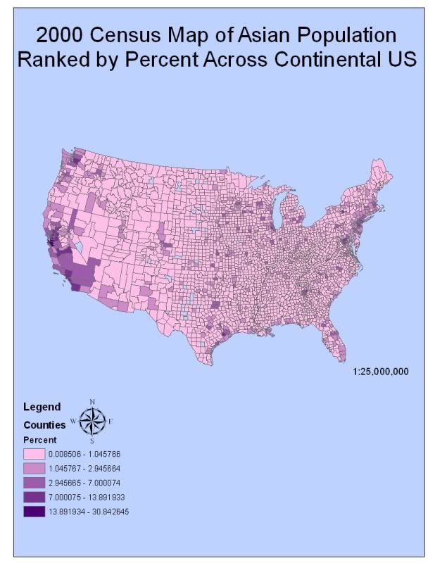
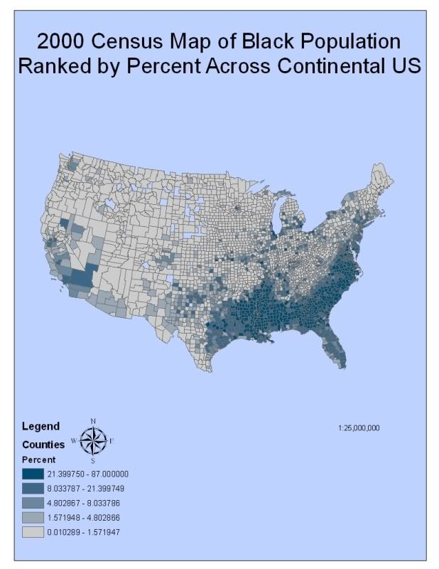
Iran Graphically Designed
For this week’s lab I chose to photosynth my best friend’s front door. The reason I chose this location is because I went back to my hometown in Orange County over the weekend and I had to use her PC and digital camera, which was located at her house. I initially tried photosynthing her coffee table in the living room but I could not achieve a percentage over 75. The reason for that, in my opinion, could have been that I was not properly applying the correct photo-capturing techniques that the photosynth tutorial provided.
One technique I did not initially follow was to begin at one location and take a panoramic photo totaling to at least three photos. I believe my first photo comprised of the image I wanted to base my photosynth on but my second one was a zoomed in image of a vase. The second technique that may have kept me from achieving above a 75% was that when I did take the panoramic pictures I did not include at least a 50% overlap. The 50% overlap helps Photosynth piece the overall image together. The third fault I exhibited was that I moved my position after each picture I took. By moving my position I, again, overlooked the importance of including overlap and may have missed important attributes of the living room that would have made it easier for the image to be photosynthesized. After spending an hour frustrated and confused I went back to the Photosynth website. I watched the tutorial one more time and I decided to download the Photosynth guide pdf for more detailed instructions. Following my thorough comprehension in creating successful photosynth images, I took a second stab and changed the location of my photosynth “map” to the entryway of my best friend’s house. To my delight, I got 100% photosynth on my first try. It is important to realize the accuracy of the photosynth directly depends on the photo-capturing techniques applied in acquiring the various images.
By applying the Photosynth technology to the images I captured, I began to wonder about the potentials this tool possesses. It reminded me of the time I got lost in Los Angeles because I followed the directions that my VZ Navigator provided me. The reason the VZ Navigator was incorrect because not all of Los Angeles is fully integrated into virtual maps. I felt this to be very surprising when I first heard this, but it made sense to me that the county, or even the city does not have the financial means to undertake such a tedious task when there’s already a ThomasGuide in existence that could be just as helpful for the time being. In an explanation to my friend on running late I can go back to the location, capture images of where I got lost and send the link to my friend. By making it public I can help others avoid using VZ navigator at this location and they will know exactly where it is because of the landmarks included in the photosynth.
Although it provides many helpful benefits, awareness of the publicity of the photosynth application is imperative. By geotagging my best friend’s entryway I released to the Internet where exactly she lives and what her front doorway looks like. This type of information can be very useful to crooks. Interior photosynths were often talked about in the tutorial and guidebook. This is good for real estate but bad to just show off on the Internet. Strangers may lurk these photos and find what treasures are hidden within your home. They may use the geotag to properly locate your home and make the treasure hunt. As long as one considers the public invasion of his privacy by posting personal images with panoramic view and zoom along with disclosing the location of such images, photosynth represents the various technologically advanced tools that will progress mapmaking through the 21st century and beyond.


